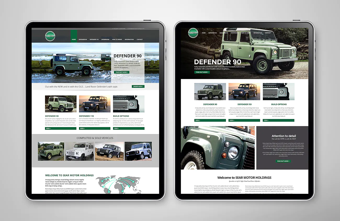
Website Development
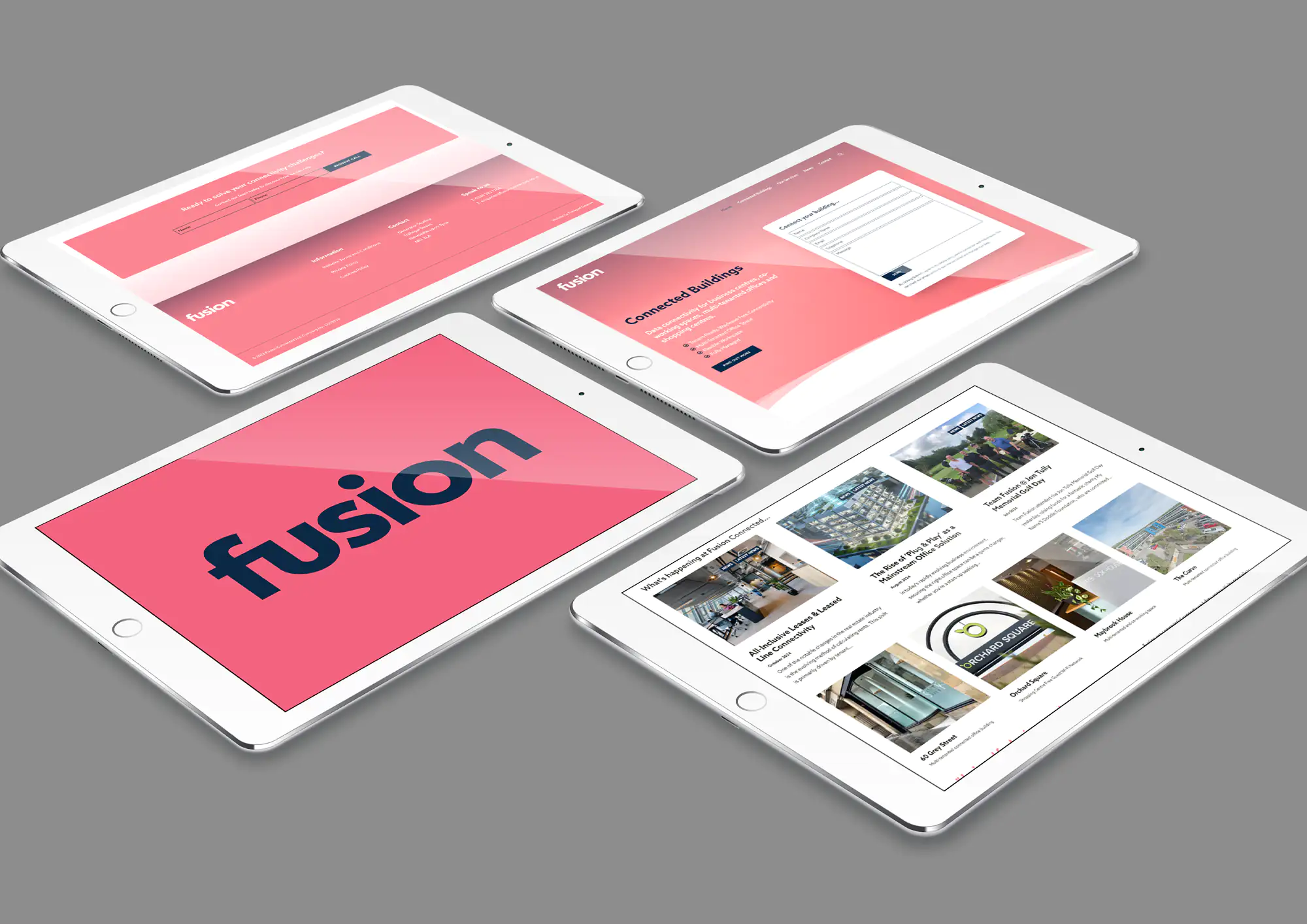
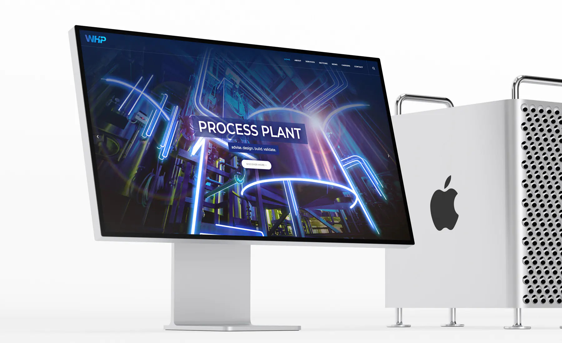
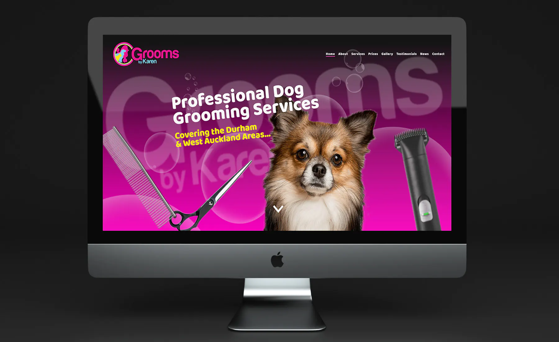
Our website development services bring you the latest web tech to engage with customers.
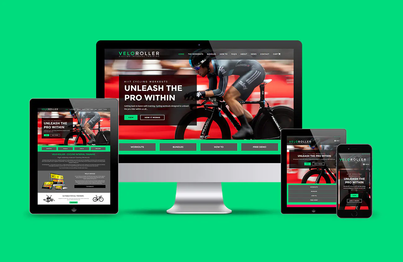
Responsive to all devices as standard.
Development of your website to enhance and refine your user engagement and drive traffic.
RWD (Responsive Website Development) is how one website is designed and programmed to provide the optimal user viewing experience across any device. Whether it is a smartphone, tablet or desktop, we design responsive websites to be easy to read & navigate.
We focus on creating responsive websites that provide the best user experience across all devices.
- Optimized User Experience (UX UI) – Responsive Website Development (RWD) ensures your site is easy to read and navigate on smartphones, tablets, and desktops.
- Seamless Design Transition – The layout adapts fluidly from one device to another without the user noticing, ensuring a consistent experience.
- Mobile-First Approach – The design process begins with mobile optimization, ensuring a flawless experience on smaller screens.
- Industry Standard – We only create responsive websites, ensuring your site meets the latest web standards.
- Expert Coding – Our experienced team implements your brand’s design across all internet-capable devices, with a focus on responsive coding.
- Perfect Brand Integration – The creative design process is seamlessly carried into the website development, ensuring the brand experience is optimized for all devices.
Responsive Website Development starts with the design stage, creating a layout that adapts and flows from device to device without the user even realising it. Visually the website must be designed to adapt to its viewing environment. It is vital to get this right before the extensive build & programming stage of your website begins.
Today, every website created should be responsive by standard, no excuse. Any agency not providing responsive layouts or coding are years behind in their industry. We ONLY provide websites that are responsive and have done so for many years now. With a wealth of experience in responsive coding we understand how to implement your brand across all internet capable devices.
Once the creative process is complete we then carry this into the implementation stages of creating your website, creating the perfect user/brand experience.
Responsive Website Development That Engages, Converts & Performs
At Thinkpad Creative, we specialise in website development that enhances your brand, refines user engagement, and drives measurable results. Your website is the digital face of your business — it must look flawless, load quickly, and perform perfectly on every device. Our development process ensures your visitors enjoy a seamless, intuitive, and engaging experience that converts interest into action.
We build responsive websites that not only look exceptional but are also SEO-optimised, ensuring your business gains higher visibility and stronger search rankings. Whether you’re a small business, an established company, or a national brand, Thinkpad Creative delivers the professional web development expertise needed to grow online.
Why Responsive Website Development Matters More Than Ever
Today’s customers browse on the go — from smartphones, tablets, and desktops alike. A static, non-responsive website instantly turns visitors away. Responsive Website Development (RWD) ensures your site automatically adjusts its design and layout to the size and orientation of the user’s device. This approach enhances both usability and performance, creating an effortless browsing experience for every visitor.
Search engines like Google also prioritise responsive websites in their rankings. This means your investment in a responsive build isn’t just about aesthetics — it’s about higher visibility, more traffic, and better user retention. With our mobile-first development strategy, we make sure your website looks as good as it performs, no matter how it’s accessed.
Mobile-First Design for a Modern Audience
At Thinkpad Creative, we adopt a mobile-first design philosophy. This means we begin with the smallest screen in mind — ensuring that every layout, image, and line of text looks sharp and functions flawlessly on smartphones before expanding to larger devices.
Mobile browsing now accounts for over half of all web traffic, making it crucial that your site’s speed, clarity, and usability perform perfectly on mobile. Our responsive websites are designed to deliver lightning-fast load times, clear navigation, and smooth scrolling. From mobile menus to fluid content blocks, your users will enjoy a premium experience no matter where they are.
A Seamless Design Transition Across Every Device
Your brand should never feel disjointed. That’s why our responsive websites are built with a seamless design transition, maintaining visual consistency from desktop to mobile. Text, images, and interactive elements adapt naturally, ensuring your visitors enjoy the same premium experience on any device.
We utilise modern web technologies such as HTML5, CSS3, PHP, MYSQL and JavaScript frameworks to achieve this flexibility. The result is a fluid, responsive interface that adjusts dynamically — not a scaled-down or restructured page, but an intelligently designed layout that adapts in real time.
Optimised for User Experience and Search Engines
Every website we create is engineered to engage users and satisfy search engines. We combine cutting-edge coding practices with on-page SEO optimisation to ensure your website performs well in Google rankings and offers a frictionless journey for your visitors.
From intuitive navigation and clear calls-to-action to image optimisation and structured content, we build websites that are both beautiful and highly functional. Our responsive development process includes technical SEO elements such as:
-
Fast-loading page structures
-
Mobile responsiveness signals
-
Accessibility and usability standards
-
Clean, optimised code
-
Schema and metadata integration
These are not optional extras — they’re core components of our development process, ensuring your site ranks well, loads quickly, and turns visitors into loyal customers.
Expert Coding and Professional Build Quality
Thinkpad Creative’s team of experienced developers and designers work hand-in-hand to transform your vision into a fully responsive, high-performance website. We use proven frameworks and coding standards to ensure compatibility across browsers and devices.
Our codebase is not only responsive but also secure, lightweight, and scalable, allowing your website to grow with your business. Whether we’re integrating advanced functionality, eCommerce systems, or interactive components, our focus remains on clean development and precise brand implementation.
Each website is rigorously tested across multiple platforms — desktop, laptop, tablet, and mobile — to guarantee flawless performance and display consistency.
Perfect Brand Integration from Design to Delivery
A website is more than just pages and links — it’s an extension of your brand identity. We ensure that your creative design, typography, colours, and imagery are perfectly translated into the responsive development process.
Our designers and developers work in unison to maintain your brand’s integrity, adapting visuals to every screen size without losing the essence of your message. The result is a cohesive brand experience that feels premium and consistent whether viewed on a 27-inch monitor or a mobile phone.
The Creative Process: From Concept to Launch
-
Discovery & Strategy – We begin by understanding your business goals, audience, and brand tone.
-
Wireframing & Design – Our design team creates responsive layouts that showcase your brand and highlight key calls-to-action.
-
Development & Implementation – We build the site using modern frameworks and responsive coding, ensuring speed and usability.
-
Testing & Optimisation – Before launch, we rigorously test your website across all devices and browsers.
-
Launch & Support – Once live, we monitor performance, make ongoing improvements, and support your continued growth.
This structured approach ensures that every project meets our high standards for performance, usability, and conversion.
Why Choose Thinkpad Creative
When it comes to responsive website development, Thinkpad Creative stands out for one simple reason — we’ve been building responsive websites long before it became the industry standard.
-
100% responsive builds – every time.
-
SEO-friendly development that boosts organic rankings.
-
Decades of combined web design experience.
-
Creative and technical teams working in harmony.
-
Custom solutions for businesses of every size.
-
Ongoing support and updates to keep your site performing perfectly.
We’re not just developers — we’re digital partners focused on helping you grow online, attract leads, and build a website that works as hard as you do.
The Importance of Responsive Standards
In today’s competitive online marketplace, a non-responsive website is no longer acceptable. Websites that fail to adapt to different screen sizes quickly lose visitors and search ranking.
At Thinkpad Creative, we design and build responsively by default — not as an add-on, but as a foundation. Every element, from the hero image to the contact form, is carefully designed to resize and reposition intelligently for optimal user engagement.
We build using industry best practices, ensuring your website is accessible, inclusive, and compliant with modern web standards. This not only improves SEO but also boosts customer trust and retention.
Future-Proof Web Development
Your website should evolve alongside your business. That’s why we create future-ready, scalable websites that grow with you. Whether you need to integrate new features, connect APIs, or expand content, our website development framework is designed for long-term performance.
Our responsive approach ensures that as technology changes, your site remains adaptable, secure, and fast. By working with Thinkpad Creative, you invest in a website that stays relevant, modern, and conversion-focused.
Measurable Results That Drive Growth
A beautifully designed responsive website is only the beginning. We focus on measurable outcomes — increased traffic, longer engagement, and higher conversions. Through analytics integration, we help you track user journeys, identify opportunities, and refine your strategy for even greater results.
From local businesses to nationwide brands, our clients see real benefits from responsive website development that enhances visibility, authority, and customer confidence.
Let’s Build Your Responsive Website Today
Your website development should do more than look good — it should perform, engage, and convert. At Thinkpad Creative, we’re ready to help you create a responsive, high-performing website that elevates your brand and drives lasting growth.
Get in touch today to discuss your project and discover how our responsive website development can transform your digital presence.